Engagement Web Component
The Medical Engagement Web component is a platform-agnostic medical information experience that can be integrated into a customer's website. The component interfaces directly with , giving customers access to key features such as medical inquiry submissions.
When integrated, the Engagement Web component will appear on the customer's website in a tile at the bottom right of the page. Clicking the tile opens the component and expands it into view.
Component integration
Once authenticated, the Medical Engagement Component Generator can be used to display a code snippet with selected CMT. This snippet can be copied directly to an html website to have the component load and display on that page. Example below.
<script type="module" src="https://d1mu6oy21or6o2.cloudfront.net/v1.0/bundle.js"></script>
<mic-mei-component client-id="00000000-0000-0000-0000-000000000000" config-name="MED_Komodo_Health_Template"/>
Alternatively, the script and component can be dynamically attached to the page from JavaScript or otherwise. Example below.
const script = document.createElement("script"); script.setAttribute("src", "https://d1mu6oy21or6o2.cloudfront.net/v1.0/bundle.js"); script.setAttribute("type", "text/javascript"); script.setAttribute("async", true); document.body.appendChild(script);
// success event
script.addEventListener("load", () => {
  // Create the web component and attach it to the dom
  const component = document.createElement("mic-mei-component");
  component.setAttribute("config-name", "MED_Komodo_Health_Template");
  component.setAttribute("client-id", "00000000-0000-0000-0000-000000000000");
  document.body.appendChild(component);
});
Component styling
The styling of the Engagement Web Component component and Inquiry sub-component are customizable from the root CSS file. Re-usage of CSS variables both within the index.css file and throughout the app dictate text sizes and general colors.
CSS variables
| Variable | Usage |
|---|---|
| mei-primary-color | For use with color themes. Sets the default color for buttons, focused input borders & labels. |
| mei-background-color | The background color of all components. |
| mei-button-color | Color of submit & close buttons. |
| mei-button-hover color | Color of buttons when hovered. |
| mei-button-text-color | Color of the font on buttons. |
| mei-font-size-lg | Largest available font size to apply to text. Default for header. |
| mei-font-size-md | Font size for any medium-sized text. Default size for sub-header. |
| mei-font-size-sm | Font size for any small text. Default size for preamble. |
| mei-font-size-xs | Smallest font size available. Default for extra small text such as footer. |
| mei-input-label-font-family | Font family of labels on input fields. |
| mei-input-font-family | Font family of input text. |
| mei-input-label-color | Font color of text label for each input. |
| mei-input-focused-label-color | Font color of the label when focused. |
| mei-input-border-color | Color of input box borders. |
| mei-input-hover-border-color | Color of input box borders when hovered. |
| mei-input-focused-border-color | Color of input box borders when focused. |
| mei-border | Color and thickness of the outermost border. |
| mei-border-radius | The radius of the border edges (sharp vs rounded). |
| mei-box-shadow | Color and size of shadow effect behind the border. |
| mei-icon-background-color | Background color behind mei-icon. Defaults to transparent. |
| mei-icon-closed | A clickable component icon that displays when the component is closed. |
| mei-icon-expanded | A clickable component icon that displays when the component is expanded. |
| mei-header-font-size | The font size of the topmost header text. Defaults to font-size-lg. |
| mei-header-color | Color of header text. Defaults to mei-primary-font-color. |
| mei-subheader-font-size | The font size of the subheader. Defaults to font-size-md. |
| mei-subheader-color | Color of the subheader text. Defaults to mei-primary-font-color. |
| mei-preamble-font-size | The font size of the preamble. Defaults to font-size-sm. |
| mei-preamble-color | Color of preamble text. Defaults to mei-primary-font-color. |
| mei-footer-font-size | The font size of the footer text. Defaults to font-size-xs. |
| mei-footer-color | Color of footer text. Defaults to mei-primary-font-color. |
| mei-confirmation-font-size | The font size of the footer text. Defaults to font-size-md. |
| mei-confirmation-color | Color of confirmation text. Defaults to mei-primary-font-color. |
Local overrides
In addition to configuration from custom metadata types, default values can be set by providing the component with an additional configuration attribute. See the Supported Field Types table for more information about valid default value definitions. This feature allows setting default values derived from the context of the hosting page or passing along additional field data that is not necessarily represented on the rendered form.
Note: Any valid field values provided this way take precedence over custom metadata type configured values.
Local overrides examples
// Directly in HTML <script type="module" src="https: d1mu6oy21or6o2.cloudfront.net/v1.0/bundle.js"></script> <mic-mei-component id="mei-component" client-id="00000000-0000-0000-0000-000000000000" config-name="MED_Komodo_Health_Template"
config='{"inquiryDefaults": {"MED_Requester_Name__c": "John Smith", "MY_Custom_Date_Field__c": "2023-08-22T16:00:00.000Z" } }'
/>
// Dynamically in javascript
const componentConfig = {
    "inquiryDefaults": {
        "MED_Requester_Name__c": "John Smith", // perhaps users name is known from website context
        "MY_Custom_Date_Field__c": "2023-08-22T16:00:00.000Z",
        "MY_Custom_Website_Field__c": window.location.href
    }
};
document.getElementById("mei-component").setAttribute("config", JSON.stringify(componentConfig));
Warning: Field names are case-sensitive and must exactly match the Qualified API name of the field or they will be ignored.
Configuration
This topic covers how to configure the Engagement Web Component for use in your website of choice.
Installation
The installation is separate from the installation. To install the , use the following link: https://install.komodohealth.com/products/mei/latest.
User permissions
Create a user specifically for the integration using the standard Salesforce license. The following permissions must be created and/or assigned.
Permission sets
Admins must create a new permission set using the following process:
-
In Setup, search for and select Permission Sets.
-
Click New.
-
Add a name for the new permission set.
-
Click Save.
-
Click Object Settings and add permissions for Inbound Forms (
MED_Inbound_Form__c) with the following permissions:-
Read and create object permissions
-
Read access and Edit access for all fields in Field Permissions
-
-
Assign this permission to the user created for integration.
The user must also be assigned the MEI Integration permission set.
This assignment grants the user access to the Apex classes, API, and
Apex REST services related to the and gives them the ability to manage
connected apps and modify metadata.
Note: Admin users must have Read / Write access to all object fields that will be interacted with by the component.
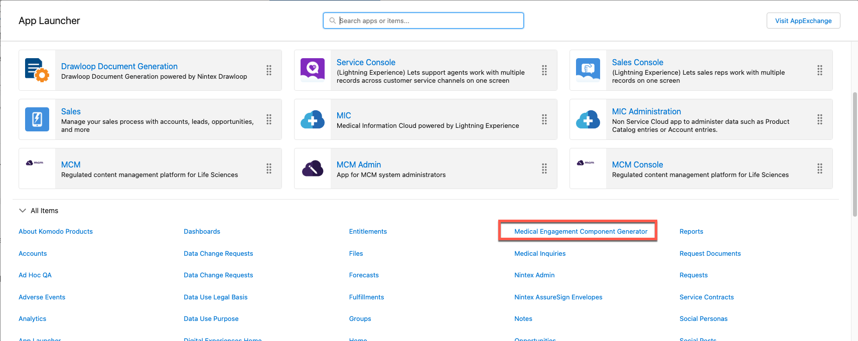
Medical engagement component generator
The component tab is available for Admin users to authenticate their org with the server and view a code snippet. They can then surface the component on their website by copying the snippet and adding it to their existing html site.
To authenticate your organization, first log in as the user, then follow the process below:
-
Send your org ID to Customer Support to authorize it for this component (requires a license).
-
From the App Launcher, click Medical Engagement Component Generator.
-
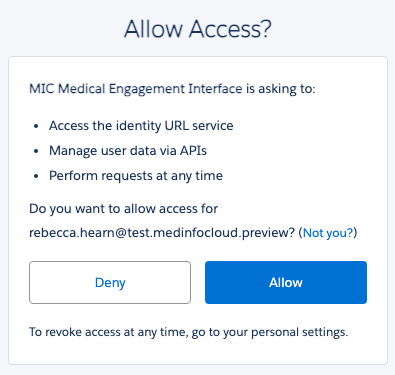
Click Authenticate to authenticate with the server.
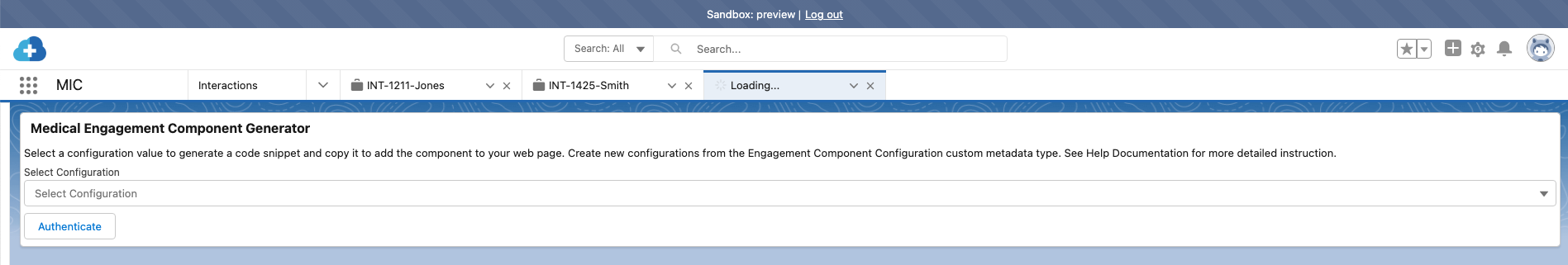
-
Click Allow when prompted. If successfully authenticated, the new browser tab opens and will redirect you back to the component generator tab.
-
Select an Engagement Component Configuration from the Select Configuration dropdown.
Warning: The "Login as another user" feature should not be used.
Localization
Component localization uses the Salesforce-provided Translation Workbench such that the component will attempt to identify a user's language from the browser and obtain values for fields and custom labels if the language is supported and translation is available. You may use the Translation Workbench to add additional language support and provide translated values for relevant field and custom labels.
Note: If translations are unavailable for the browser language, the default language labels will be used (English).
Troubleshooting
You may encounter the following issues:
-
You see the following error: "You are not currently licensed for this service. Contact your representative for more information." This error means your org has not been whitelisted.
-
Your org does not redirect you back to the Engagement Component Configuration tab after authentication. Refresh the page as this can take a moment to process.
Engagement Component Configuration custom metadata type
The Engagement Component
Configuration
(mvn__MED_Engagement_Component_Settings__mdt) custom metadata type is
used to configure how the component behaves, including which features
are available, default values, and labels. For clarity, these fields
have been separated into two distinct tables: General fields
and Inquiry Submission fields.
Engagement Component Configuration
| Field | Description |
|---|---|
| mvn__MED_Active__c | Controls the overall visibility of the component. If disabled, the component will not render on the embedded page. :::: note ::: title ::: if the component is active but no individual features are active, the component will not render. :::: |
| mvn__MED_Available_Product_IDs__c | Contains a list of all available products visible to the component, specified by CMS ID delimited by new lines or semicolons. The products specified must be available for the country code provided in mvn__MED_Country_Code__c. If blank, all products from the corresponding County Code field will be available. |
| mvn__MED_Close_Button_Label__c | The custom label to use for close button text. |
| mvn__MED_Country_Code__c | The two-letter country code that specifies the region of the component. This determines the regional values available to the component such as available products and sets the default value for the MED_Country__c field in the Inbound Form custom object. |
| mvn__MED_Default_Language__c | The default language for the component translations and data. This is used if the user's language cannot be derived or is not supported and sets the default value for the MED_Language__c field in the Inbound Form custom object. |
| mvn__MED_Default_Product_ID__c | The CMS ID of the default product that is to be displayed and selected on the component. If specified, it is automatically treated as being added to the mvn__MED_Available_Product_IDs__c field. |
| mvn__MED_Generic_Error_Label__c | The Salesforce custom label to use for text to indicate an unexpected error (e.g., inquiry submission failure). |
| mvn__MED_Submit_Button_Label__c | The Salesforce custom label to use for the Submit button text. |
(mvn__MED_Engagement_Component_Settings__mdt) custom metadata type | |
| general fields |
Engagement Component Configuration (mvn__MED_Engagement_Component_Settings__mdt) custom metadata type Inquiry Submission fields
| Field | Description |
|---|---|
| mvn__MED_Inquiry_Channel__c | The default value to use for the MED_Channel__c Inbound Form field. This field can be used to track how the Inbound Form was created. :::: note ::: title ::: Required if Inquiry Submission Enabled is true. :::: |
| mvn__MED_Inquiry_Confirmation_Label__c | The Salesforce custom label to use for text displayed after an inquiry submission is successfully submitted. |
| mvn__MED_Inquiry_External_ID_Prefix__c | The prefix for Inbound Form External ID to use when submitting inquiries. This can be used to track how the Inbound Form was created. :::: note ::: title ::: Required if Inquiry Submission Enabled is true. :::: |
| mvn__MED_Inquiry_Footer_Label__c | The Salesforce custom label to use for text is displayed as a footer under inquiry submission form fields. |
| mvn__MED_Inquiry_Header_Label__c | The Salesforce custom label to use for text is displayed as a header of the inquiry submission form. |
| mvn__MED_Inquiry_Preamble_Label__c | The Salesforce custom label to use for text is displayed as a preamble above inquiry submission form fields. |
| mvn__MED_Inquiry_Subheader_Label__c | The Salesforce custom label to use for text is displayed as a subheader of the inquiry submission form. |
| mvn__MED_Inquiry_Submission_Enabled__c | This field controls the visibility of the inquiry submission feature. If no features are active, the component will not render. |
| mvn__MED_Inquiry_Submission_Fields__c | The JSON value specifies which Inbound Form fields should be displayed if they are required, and the order rendered on the component's inquiry submission feature. Any fields specified that are not valid (either because they don't exist, or the Admin user does not have read access to) are ignored. Example Valid JSON: { "MED_Requester_Name__c": { "required": true, "order": 1 }, "MED_Email__c": { "required": true, "order": 2 }, "MED_Inquiry_Text__c": { "required": true, "order": 3 } } :::: note ::: title ::: Required if Inquiry Submission Enabled is true. :::: |
(mvn__MED_Engagement_Component_Settings__mdt) custom metadata type | |
| Inquiry Submission fields |
Inquiry submission
At a high level, the Inquiry Submission feature creates a form on the component which, when submitted, creates an Inbound Form record in the connected Salesforce org. Inbound Forms are then automatically processed in to create corresponding Interaction and Request records. Visit Inbound Forms for more details.
Submitting a medical inquiry
Once configured on your organization's website, the users will able to see the component and click to expand it, revealing the inquiry submission form. The user can then input the following information:
-
Requester Name
-
Email
-
Phone Number (optional)
-
Inquiry Text
Note: The fields above are configurable using the Inbound Form Fields (
mvn__MED_Inquiry_Submission_FIelds__c) custom field in the Engagement Component Configuration (mvn__MED_Engagement_Component_Settings__mdt) custom metadata type.
Once all required fields are complete, the user will click Submit, thereby creating an Inbound Form record. The record is then sent to the connected Salesforce Org where it will be routed to the Medical Information team.
Supported field types
The component supports a subset of available Salesforce Data Types. See the Component types table below for details about supported types and corresponding details.
-
Component Input Type: How the type is displayed in the component.
-
Field Data Types: Salesforce setup UI Data Type equivalent.
-
Default Value: Default value displayed in the component form field unless otherwise specified.
-
Form Validation Rules: Validation rules are applied to the field type when a user attempts to submit the form.
-
Default Value Override JSON Format: Accepted JSON value types to set field default values directly from component configuration attribute type.
Note: Validation rules only apply to fields displayed on the form at the time of submission except for picklist values.
Component types
| Field data types | Component input type | Default value | Form validation rules | Default value override JSON format |
|---|---|---|---|---|
| Checkbox | Checkbox | Unchecked | None | Boolean or string value Example: true, false, or "True" (as a case-insensitive string) |
| Email Phone Text | Text | Empty | Max Length Email Regex: /^[^@\s><)()[\];:\\]*@[A-Z0-9.-]+\.[A-Z0-9.-]\{1,\}$/i | String value Example: "My Text Value" |
| Text Area Text Area (Long) Text Area (Rich) | Text Area | Empty | Max Length | String value Example: "My Test Area Value" |
| Currency Number Percent | Number | Empty | (Length - Decimal Places). (Decimal Places) | Number or string representation of a number Example: 1.23 or "1.23" |
| Date | Date Picker | Current Date | None | Iso 8601 valid string Example: "2023-08-22" |
| Date/Time | Date Time Picker | Current Date / Time | None | Iso 8601 valid string Example: "2023-08-22T16:00:00.000Z" |
| Time | Time Picker | Current Time | None | Iso 8601 valid string Example: "01:00.000Z" |
| Picklist | Picklist | Picklist Default Value or None | Value Exists in Defined Values | String of a valid picklist value (case-insensitive) Example: "Email" or "email" |
| Picklist (Multi-Select) | Picklist with multi-select | Picklist Default Value or None | Value Exists in Defined Values | String of a valid picklist value (case-insensitive) Example: "Email" or "email" |
Note: Dependent picklists are supported. If used, both the controlling and dependent fields should be included on the form, otherwise, the dependent field will not be displayed.
Special fields
Certain Inbound Form fields in the Inbound Form (MED_Inbound_Form__c)
custom object have automatically set default values or are otherwise
handled in special ways.
For example:
-
MED_Product__c: This field is defined as a String data type but is handled as a picklist in the component user interface. The available and default values are controlled by the
mvn__MED_Available_Product_IDs__candmvn__MED_Default_Product_ID__c. -
Fields with automatic default values: These fields will have default values applied and will be sent with inquiry submissions regardless of whether they are displayed on the form.
-
MED_Country__c: Automatically set to the
mvn__MED_Country_Code__cvalue from the custom metadata type. -
MED_Language__c: Automatically set to browser-detected language (if a valid picklist value) or
mvn__MED_Default_Language__cfrom custom metadata type. -
MED_Channel__c: Automatically set to the
mvn__MED_Inquiry_Channel__cvalue from the custom metadata type.
-
-
Fields with automatic values that cannot be overridden and should not be added to the form UI: These fields will have default values applied and will be sent with inquiry submissions. Do not add them to the form directly, as their values will always be overridden.
-
MED_External_ID__c: Automatically set to the
mvn__MED_Inquiry_External_ID_Prefix__cvalue from the custom metadata type and a random UUID. -
MED_Date_Submitted__c: Automatically set to the date when the submit button is clicked on the form.
-
MED_Datetime_Submitted__c: Automatically set to the date/time when the submit button is clicked on the form.
-